Learn how the EA Sports FC brand identity came to life, including the creation of its logo, typography, and color palette.
The Idea Behind the EA Sports FC Brand
The inspiration behind the new brand comes from the triangle, a dominant shape in football culture that has transformed the game through passing patterns and set plays, from legendary figures like Cruyff to modern-day innovators like Guardiola. This shape has revolutionized football in many ways, and now it serves as the inspiration for the biggest football club in the world, bringing a fresh perspective and innovative ideas to the sport.
The triangle shape has been an integral part of EA SPORTS football games for several decades. It has been featured in various forms, from isometric angles in the earliest 8-bit games to triangular polygons in the latest modern games. Additionally, the triangle has been a symbol of the player indicator that appears above every athlete in every match. This iconic shape has been a silent participant in the game for over 30 years and is now ready to take center stage.
The triangle is not only present in the new logo but has also been integrated into the overall visual design of EA SPORTS FC. The triangular grid system serves as the basis for the brand’s future design elements. The isometric grid is composed of multiple triangles, symbolizing the strength of the collective and the idea that change in the game can only happen when everyone works together.
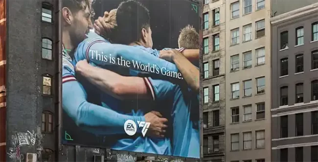
Additionally, Uncommon, the branding agency, has created a new photography style that places fans at the center of the action. This photography will be used across all brand touchpoints in the coming year.
The New Logo

The new logo of EA SPORTS FC is designed using a triangular grid system to reflect the significance of the shape in the history and culture of football. To ensure the new brand is reflected across all touchpoints, there are three versions of the logo, all inspired by the triangle: a primary logo, a two-letter product prefix, and an authenticity mark to be shared with various partners.
The motion system, which extends the triangle shape, takes inspiration from the game itself, with its energy, dynamics, and forward momentum made tangible through motion. This is expressed through 2D animation and motion design, bringing the brand to life in a way that captures the essence, boldness, and foundations of EA SPORTS FC.
The Typography
The new brand guidelines feature two unique and flexible custom typefaces, both of which draw inspiration from iconic playing styles. The first font is influenced by the famous Cruyff turn, with its structural forms based on character stems and ink traps that align with the triangular grid system.
The second typeface is inspired by the grace and flair of Brazilian footballer Marta, and features serifs that provide an elegant simplicity suitable for editorial communications and special brand moments.
In addition, these fonts have been designed with multilingual typeface settings that can accommodate various language-specific scripts, from Latin to Arabic, allowing the brand to reach a wider global audience.
Colour Palette
The new brand colours of EA SPORTS FC were designed to have a universal significance that can appeal to football fans worldwide, regardless of their team allegiance. The monochrome colours of Boot Black and Chalk White, along with shades of Pitch Green and Forest Green inspired by the field of play, form a fixed palette that will be used across all brand assets, both digital and physical. This colour scheme acts as a canvas for the colourful and diverse nature of football fandom around the world.
Who Created the New Brand
The new brand was created by multiple companies, including Uncommon, BUCK and EA itself.
David Jackson, VP Brand, EA SPORTS FC said:
“Football comes in many colours, but only very few shapes. Through set pieces, formation design and elegant possession patterns, the language of the beautiful game is often communicated in triangles. The shape has also been deeply embedded in EA SPORTS football games for decades; from the isometric angles of our very first 8-bit experiences to the iconic player control indicator that appears above every athlete in every match — triangles play an essential role in the building blocks of EA SPORTS football experiences. We’re energised to bring this core symbol of football’s foundations to life through EA SPORTS FC.”
Haider Muhdi, Design Director at Uncommon added:
“For the logo we teased out a fundamental icon, rooted in all aspects of the beautiful game. A symbol of power that’s literally in the hands of those who control it. A distinctive form that’s been part of the gameplay (DNA) from the very start, right up to the present day. Hiding in plain sight for almost 30 years, the inverted triangle became our playmaker. Forging the EA SPORTS FC identity directly through it and then building a prolific design system around it. Viva FC.”
Jon Gorman, Creative Director, BUCK said:
“We see the motion design system as an integral piece of the puzzle in the launch of the EA SPORTS FC brand. Our goal was to imbue the visual identity with the energy of the game itself — its structure, dynamics, forward momentum — to evoke how football feels, both as player and fan. A worthy embodiment of the poetry, fearlessness, and joy of EA SPORTS FC.”